Evolving RFM analysis for retailers this holiday season


A natural extension of the Pareto principle which tells us that 80% of sales typically come from 20% of clients, RFM goes further to better understand the behavior of customers, and how best to convert them. Dedicated innovators, at Dotdigital, we’ve gone that one step further again. For businesses interested in behavior-based targeting and reporting, Dotdigital makes these activities possible with its customer dashboard and contact segment builder.
When interviewing retailers about RFM, they challenged us to go deeper and help them understand customer behaviour over time. Taking this back to our teams working on data science, we could not have been happier. We were already thinking and prototyping ideas in this area and were convinced of its value.
Some examples of what retailers were interested in include:
- Examining how the number of at-risk customers changes over time;
- Tracking the effects of a two-month marketing the campaign focused on increasing customer loyalty;
- Targeting new customers who have become inactive in a specific time frame;
- Seeing where loyal customers come from.
We knew, with Black Friday on the horizon and moving into Q4, that these items were going to be more important than ever. What’s more, during the holiday season, your customers don’t act in the same way they do the rest of the year round. We needed a report that would be as diverse as your customers’ behavior.
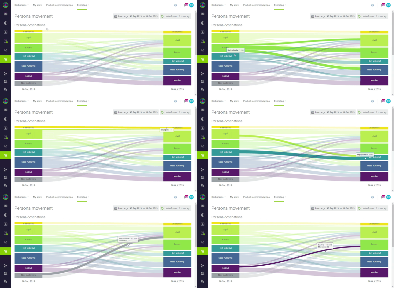
To visualize this in a concise and attractive way, we chose to use a Sankey diagram.

The Sankey diagram’s origins date back to steam engines, where the first one was used to show the movement of thermal energy through a system. Today their use is incredibly widespread. From tracking energy production to tracking voting habits – Sankeys are popping up everywhere. Their use is not always appropriate, or enlightening of the data being presented, but Sankeys are a great fit for our analysis of A-to-B movement.
Our persona movement report is designed to be interactive. Hovering over a starting persona shows pipes representing destinations; hovering over a destination persona shows pipes representing sources. Finally, you can hover over a discrete pipe to see the contacts moving between a source and a destination. The pipe is clickable, allowing you to dial in a contact segment and target customers who made that specific movement in the specified time frame.
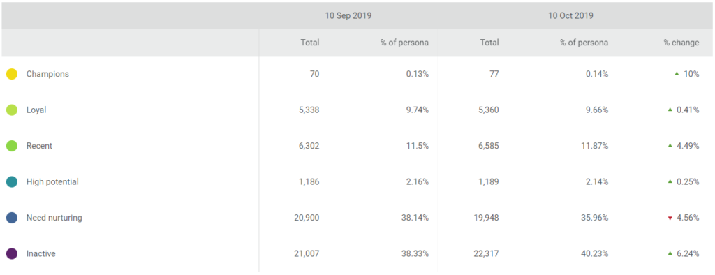
In addition to the Sankey, our movement report also tracks the population size changes for each RFM persona between two time periods.

Another great thing to note here as we head into Halloween, Thanksgiving and beyond is just how robust our RFM model is. It’s not just your customers that change in the holiday season, it’s your definition of these RFM personas themselves. Because they are defined by segmented pots with assigned values of 1-5, the goal posts are always shifting. A valuable purchase in August of £50 might be a drop in the ocean compared to the larger spending in November on Black Friday, so the model must, and does, react and respond accordingly.
Being armed by persona movement reports on top of this means you have a better idea of your customers (and therefore better plans of action) across 12 months, instead of writing off valuable data because of seasonal abnormalities.
You already know that customers behave in different ways. The data is clear just by looking at your retail dashboard. But do you treat them differently even after knowing this? And how do you do that? Well, it’s true that persona movement reports won’t help you come up the amazing personalization that you, as a marketer, are so good at. But it will empower you to improve re-targeting, measure what’s working, and give you the kind of insight that inspires great campaigns; ones that are every bit as unique and diverse as your customers.
Start sending smarter messages now. Download out factsheet on Commerce Intelligence here.

