How to boost your on-site newsletter signups


Getting a website visitor to subscribe to your email marketing is the first transaction you’ll have with a new customer. It’s the ultimate low-risk transaction. For an email address, you’re giving them exclusive access to your brand, discounts, offers, and sales. But how do you convince them to sign up?
How to build an email list fast
There are a couple of great techniques you can use to help boost the number of new email subscribers sign up via your website.
Using some or all these will help you create high-converting email newsletter signup forms on your website.
1. Offer an incentive
Customers are looking for the best deal possible. By offering an incentive you’re providing subscribers with immediate value. 10% off first orders or free shipping always goes down well.
2. K.I.S.S. – Keep it super simple
A key design principle, you should aim to keep your signup forms as simple as possible. Keep the number of fields as low as possible. Three is the perfect number as it allows you to collect first name, last name, and email address.
3. Make your CTA clear
Stay away from generic CTAs such as “Send” or “Submit”. You want them to subscribe, so a “Subscribe” call to action would be far more effective here. If you’re choosing to offer an incentive, reinforce it with your CTA: “Get 10% off” or “Get free shipping”. And don’t forget to make your CTA accessible on every device, including mobile and tablets.
4. WYSIWYG
What you see is what you get. Basically, tell the subscriber what they can expect from you. Whether it’s exclusive discounts, early sales access, or downloadable content let your website visitors know. This will remind them of the added value they’ll receive when they subscribe.
5. Back it up with social proof
It could be Feefo star rating, Trustpilot reviews, or UGC from your social media channels. Showing new subscribers that customers love your service or products is a massive selling point for someone sitting on the fence.
Newsletter signup form examples we love
Gamified popover form
Adding gamification to your email sign up form is a brilliant way to engage potential customers.
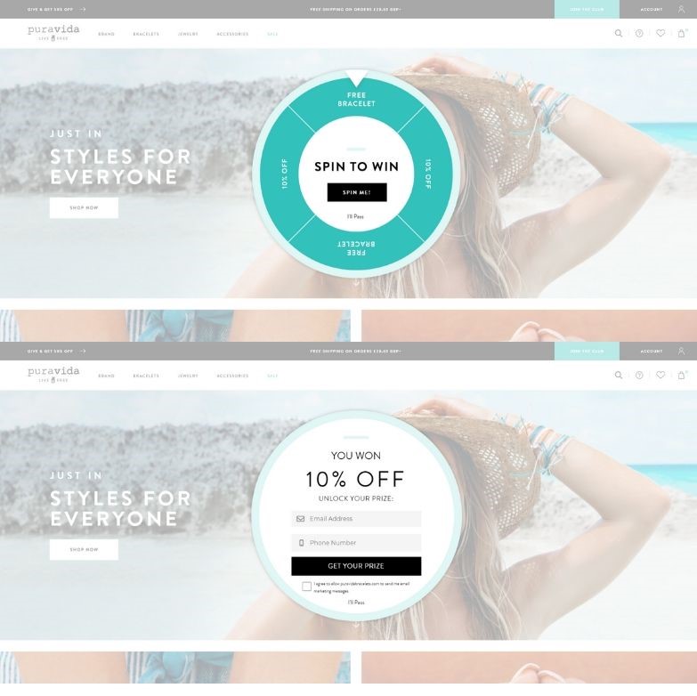
We love this fun example from the jewelry brand Pura Vida. To unlock your prize all you have to do is submit your email address and phone number. This helps the brand get the customer data they need to contact subscribers on more channels. We also love the direct CTA used here. “Get your prize” drives the subscriber into action.
Above-the-fold signup form
Like when you design your emails, you should be thinking about where to place your on-site signup form.
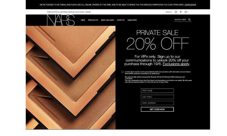
In this example from the cosmetics company NARS, new visitors are immediately encouraged to subscribe. The benefit of doing so is clear. The CTA drives clicks by hinting at the discount code to come. And the brand keeps its data collection basic so as not to turn shoppers off with a long form.
Social proof supported form
Shoppers trust their peers far more than they trust the say-so of a brand.
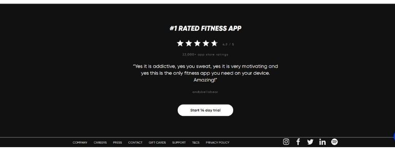
That’s what makes this example from the fitness brand Fiit so effective. To encourage new subscribers to enroll in a free trial, they mix star ratings with user-generated content. There’s a great show of integrity here, as the brand proudly displays its 4.9/5 stars from over 22,000 app store reviews. This all helps support their claim to be the number 1 rated fitness app out there.
Incentive-driven email subscription
If you’re offering an incentive make it obvious to your website visitors. Brands often hide the bonus 10% off when you subscribe in the website footer, along with the subscription form itself. It’s a top tactic for building your email marketing lists fast, so make it stand out.
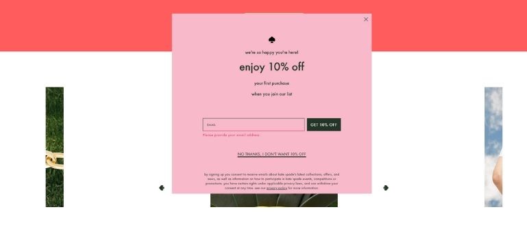
This example from the fashion brand Kate Spade is simple but effective. “Enjoy 10% off your first purchase when you join our list” is emphasized in its CTA “Get 10% off”. They even include a cheeky “No thanks, I don’t want 10% off” CTA for those looking to dismiss the popover. All in all, you’d be mad not to sign up.
What you see is what you get subscription form
The browsers landing on your site, might not know what they’re looking for. That’s the nature of the Google generation. They type in a query and see where it takes them. It’s up to us marketers to show them that what they need, is what we’re selling.
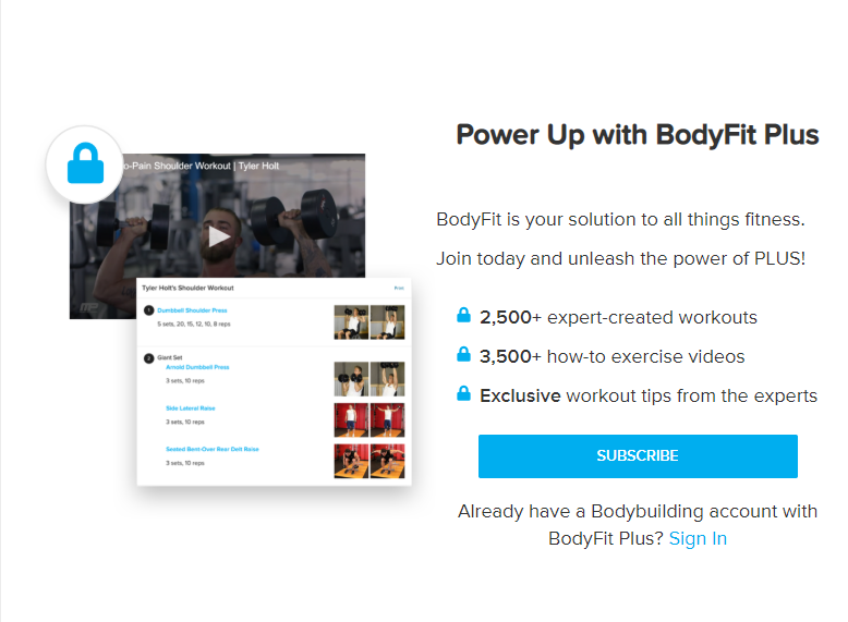
That’s what fitness website bodybuilding.com does. The brand outlines the benefits subscribers would receive by joining their BodyFit Plus program.
Exit intent popover form
A tactic steadily growing in popularity, the exit intent popover appears when a browser looks like they might leave your site.
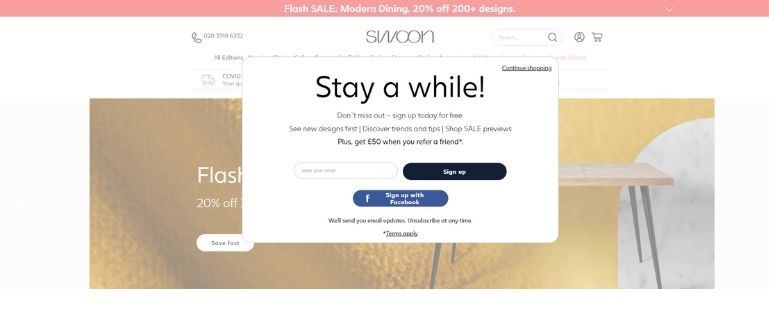
Furniture design company Swoon uses exit intent to trigger their popover newsletter form. We love the way the brand also offers website visitors the option to sign up via Facebook. This increases the number of channels you can target customers on and enriches your customer data based on their social profile.
It’s also a very clever tactic to mention the refer a friend scheme at this stage. As a result, it’s increasing the likelihood of converting the shopper while building its mailing list.
Optimize your email newsletter signup forms
We’ve highlighted the tactics adopted by these brands because we think they’re clever, effective, and well designed. But that doesn’t mean they’re going to be right for you. To discover the best option for your specific site, product, and brand, you need to be testing.
Try different tactics, maybe create your own, but you need to find what works for you.
Want more insight?
To discover more tactics, hints, and tips about creating the perfect on-site subscription form download our latest email essentials cheatsheet: how to grow your mailing lists.
