How to build your brands with popups


Popups are one of the trickiest and controversial elements of ecommerce marketing tactics. They are typically associated with annoyance or frustration and frankly, with good reason. Too many brands and websites use them to bombard their visitors with messaging that’s irrelevant or not useful making an extremely unfriendly user experience. Why then do companies continue to use them? Shouldn’t they have died out a long time ago?
The reality is that popups are only annoying when they’re used poorly and their purpose doesn’t serve the visitor. Examples of annoying popup moments are:
- Covering up an entire webpage
- Firing the moment a visitor lands on a page (or displaying the same one several times)
- Taking users off-site
- Making it difficult (or impossible) to close out of
- Displaying irrelevant or useless offers
The list goes on. It’s not unreasonable to say that every web user has been to a website only to be greeted by a bad popup (or several) which is why so many of us have a negative perception of them.
Then why use them?
At their core, popups were invented to help websites display or promote information useful for the website’s visitors, not detract from their experience. And, most importantly, frustration does not necessarily equal ineffectiveness (though frustration should hopefully not be a part of your site’s experience).
With the rise of ecommerce and digital agencies, popups are tremendously useful for brands: building an email (or SMS) list, offering discounts, promoting sales, recommending products, and driving user behavior. Additionally, they provide ample opportunity for a more personalized customer journey, which leads to better customer-brand relationships, loyalty, and bottom-live conversions. Marketers see an average increase of 20% in sales when using personalized web experiences.
These are just a few of the ways that popups can improve the user experience of a site. As far as ecommerce marketing tactics are concerned, popups remain one of the easiest, fastest, and most effective ways of increasing conversions across the board.
So, all brands need is simply a guiding hand to get them there.
Should I use popups?
(Hint: Does it help the customer?)
The short answer is yes. The long answer is still yes, but with a few caveats.
With the rise of such a variety of brands and products, consumers have more options for the same products than ever before. Marketing should be dictated by the consumer’s needs and how you can help fulfill them. Popups, underneath the umbrella of conversion rate optimization, are not much different.
Ask these questions to determine if you need to use a popup or note:
- How does this help website visitors?
- Is this information readily available elsewhere or useful?
- What action do I want to lead them to take?
- Is it intrusive or annoying to a new visitor?
Your answers will determine not only if a popup is the right vehicle for your message but the way your popup should interact with visitors. Also, consider that for every $92 spent acquiring website visitors, only $1 is spent converting them.
The different kinds of popups
There is a surprising variety of popups, and some might not fit into what you think of as a popup. The true power of popups today is that they can be tailored to any purpose and audience.
Lead capture
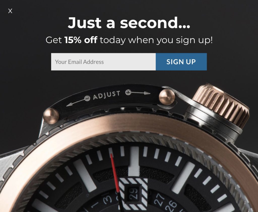
Lead capture popups are one of the most common popups visitors see. These typically appear in the middle of the page for a visitor’s first arrival (after about 30-60 seconds) on a site asking for an email in exchange for a discount. However, lead capture promotions can take the form of corner slide-ins, banners, gamification (or spin-to-wins), and more that appear throughout the website. Anything that gets their contact information into your hands is a lead capture.
There’s a reason lead capture promotions are one of the most popular popups. 95% of website visitors leave the site without a trace, and it’s crucial to get what you can, especially if you paid a lot to get them there. Asking for a name, email, product preferences, or gender can go a long way for future remarketing efforts, on and off-site. Turning anonymous traffic into a subscriber is the first step in a successful CRO strategy.

Exit offers and cart abandoners
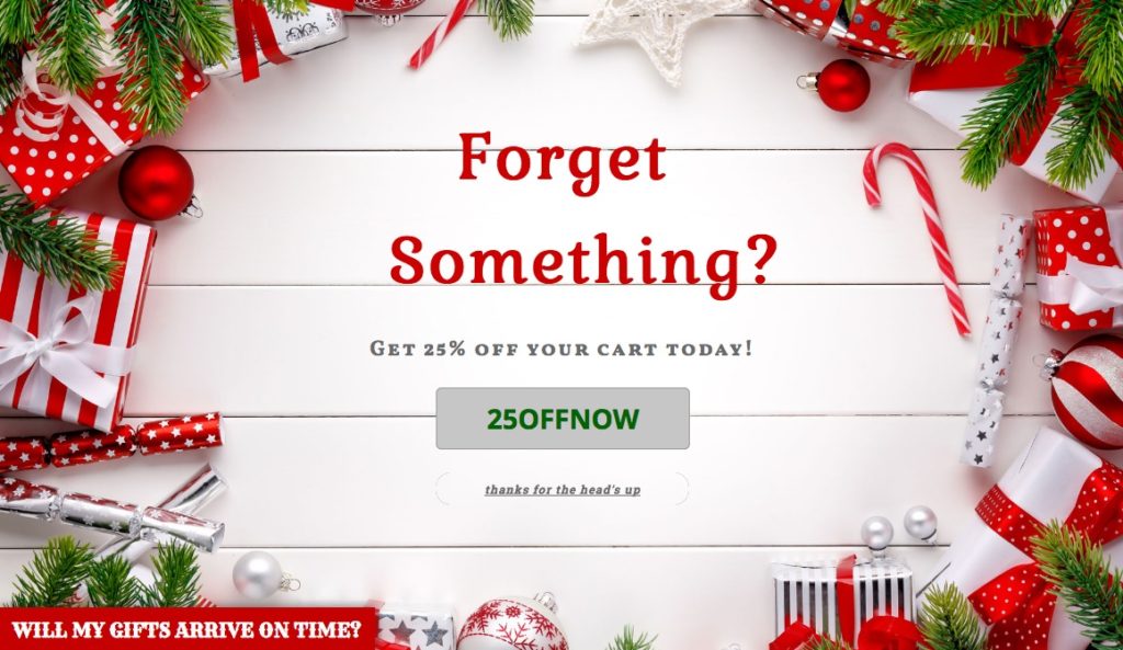
These popups are designed to convert visitors as a last-shot attempt before they leave the website, often paired with an ungated discount (you’ll get their email address when they checkout!). With a lead capture and exit offer combined, brands often see a marked decrease in visitors that leave without a trace. Even a few more percentage points of engaged visitors can mean a tremendous amount of new revenue for a high-traffic site.

Banners
While they don’t “pop up”, banners exist within the popup umbrella. They can be used to display brand announcements, sales, countdown timers, text-tickers, and more. Banners are the ideal promotion to use for any important announcements that should be communicated site-wide. Situations that can affect large segments of your customers like a shipping delay can be communicated easily. Here being transparent with customers can go a long way, putting out a shipping fire before it starts. Other uses, like a sale countdown timer (especially relevant for BFCM), can spur customers to convert or help get rid of excess supply.
How to use popups
People report frustration and annoyance with popups for good reason – too many companies have used them in all the wrong ways for far too long. That’s the simple fact of the matter. Whether it’s too many at once, making it difficult (or impossible) to close out, showing the same over and over, or just making for an incredibly friction-heavy experience, brands aren’t using them right. When used correctly, the opposite happens: Customers are happier, more loyal, and more visitors convert.
How to make the transition?
Give your customers space
Don’t flood their screen with too many popups at a time, regardless of what they are – banner and lead capture, corner slide in, and a spin to win. This may seem obvious, but a surprising number of websites continue to spam their visitors and drive them out, leaving a bad taste in their mouths.
Make it personal: Intelligent visitor targeting
You can have several popups set up for your site. In fact, we recommend it. However, it’s crucial that you’re targeting visitors appropriately – whether it’s a new visitor rule (only show to new visitors that have never engaged with it before), an exit offer (only show to users that are about to leave), or targeting based on their traffic source like social media or email. The more specific when targeting visitors, the more likely they will convert and appreciate the offer you’re providing them.
By coordinating targeting rules you can ensure each segment of visitors will receive an experience designed to fit them, elevating the popup game starts with targeting people with the right message at the right time.
Provide genuine value
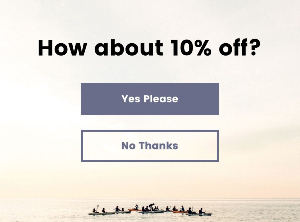
Is the popup providing genuine value to visitors? That is the most important question when creating and using popups. If they give me their email, will I spam them or will I send them useful information on new products, sales, or services? Is that 10% off discount for their first order enough? Would they prefer a free sticker or product sample instead? Like all marketing, know and respect thy audience.

Be creative and A/B test
Is it original and on-brand? Popups are normalized, but a bland “Give me your email address” won’t get anywhere with an increasingly intelligent and internet-savvy online audience. Be creative and incorporate fun messaging. Popups are a great way to show the human side of a brand – make jokes and make them feel noticed. Lastly, test, test, test. Utilize A/B testing to know what’s working the best – where, what, how, when – and you will find great success.
Popups are not the enemy
Justuno works hard to educate marketers and brands about popups. They can dramatically improve a visitor’s experience and allow a company to build better relationships with their customers with personalized onsite experiences.
Much like passive income, the initial hurdles of setting up pop ups (which is easier than ever before) can lead to dramatic improvements in business and long-term returns with improved bottom-line conversions, average order values, email marketing and SMS lists, revenue, more loyal customers, and more. There’s no reason to not start today.


