4 things that will make your email design great


And with your customers more visually literate every day, and their inboxes more crowded, nice email design isn’t just nice to have, it’s essential.
So, what do you need to bear in mind when designing a top-notch email? You should think about:
1. Your brand
Your emails are an extension of your brand. Stick to your company’s color palette and fonts (and be consistent with them!) and include your logo or other brand assets.
2. Placement of text, images, buttons, and white space
People tend to scan images and text in documents and emails in a F-shape pattern. This means that the top few lines, calls to action, and images will draw the most attention. Whereas subscribers will start to absorb less, the further down the page, and could drop off completely. Try to avoid anything important in the bottom-right hand space of your emails. Strong hero images with clear calls to action are important. As is white space, which will allow your content to breathe and permeate the thought space of your customers.
3. Storytelling
Having a clear narrative isn’t just important for your copy. Fluid design should signpost readers from start to end, and point them to the right place. Just like a story would divert your attention to something significant, so should your email design.
4. Optimizing for mobile
More emails are now opened on phones than on desktops and laptops. It’s more important than ever that your emails aren’t just ‘mobile-friendly’, but designed specifically for mobile, whether that’s in app or on a mobile browser.
Does it seem like a lot to consider? Well we have some good news. At dotdigital, our success is your success. Between us, we have a vested interest in your campaigns being amazing, and we love seeing all the beautiful emails you create and send out to your customers. Sexy-looking emails will always result in better engagement rates. So, with all this in mind, here’s what we came up with recently to make your job that bit easier, and your campaigns even better looking.
New email design templates are here!
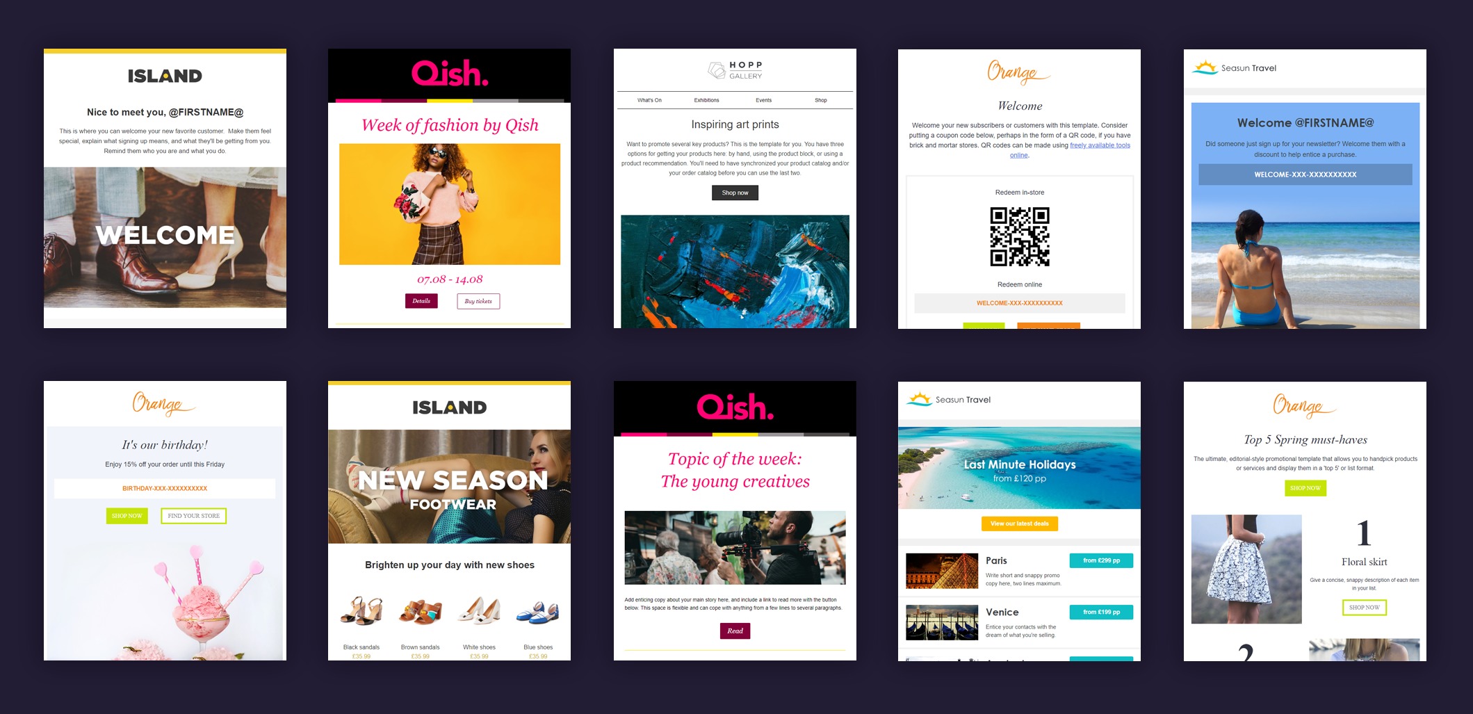
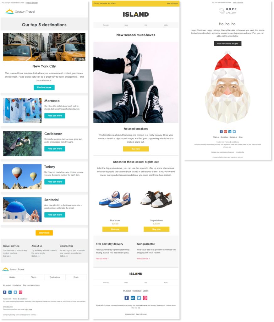
And we haven’t just optimized design for the eye, we’ve also optimized further for mobile experiences. Image-led or editorial, there’s a wide selection for you to choose from, depending on your industry type or email purpose. Whether you’re a retailer with a product promotion or a charity with a special event, there’ll be a template for you. Pick the design that most aligns with your brand and message, and get started.

Templates make your life a lot easier, but you still have control
Using an email template doesn’t mean you can’t personalize your brand. With Dotdigital templates, you can use your own logo, color scheme, web-friendly fonts, and even drag-and-drop blocks in our much-loved Easy Editor. That’s not to mention ramping up your HTML editing expertise, should you want a bolder design. Templates aren’t here to take over your creative impulses. Think of them as an array of skeletons to build yours sends up quickly.
Have a look for yourselves!
Whether you work off a template or design emails from scratch, we hope our new templates highlight what’s possible in Dotdigital. There are even festive designs as we head into the winter shopping season!
Let us know what you think in your account or sign up for a free trial to see for yourself.


